
Marc Jacobs Beauty has returned with whimsical, playful packaging that has got tongues wagging, generating a level of hype, attention and conversation that any brand would die for on a relaunch of this scale.
Brought back due to an updated licensing deal with Coty, Marc Jacobs Beauty’s revamped make-up packaging is being judged by OG fans, new customers and the wider industry alike, and the reviews are somewhat mixed.
While some love the collectable, pop art-style nature of the new packaging, others argue that it is slightly bulky and potentially too young-looking for the luxury price point.
On Marc Jacobs Beauty’s Instagram post on 21 May, which revealed the new packaging for the first time, the comments highlight this mix of excitement and disappointment from the fan base, which has continued post-launch.
Instagram user Ksha (@ksha.blog) commented: “Where’s the OG classic packaging? It was like half the appeal for me?”
Kay Zinn (@pathofvenus) shared the same sentiment, also commenting on the post: “I think there was a better way to make fun, colourful and whimsical packaging, while managing to be chic and reflect the price. This was not it.”
Meanwhile, user Kailey Waskall (@occupationbeauty) was one of many in favour of this design shift, commenting: “Literally so obsessed with how inclusive the packaging looks.”
Have you launched an innovative product, brand or campaign in the past 12 months? Then you could be in with a chance of winning at this year's new and improved Pure Beauty Awards 2026. Click here for more information.
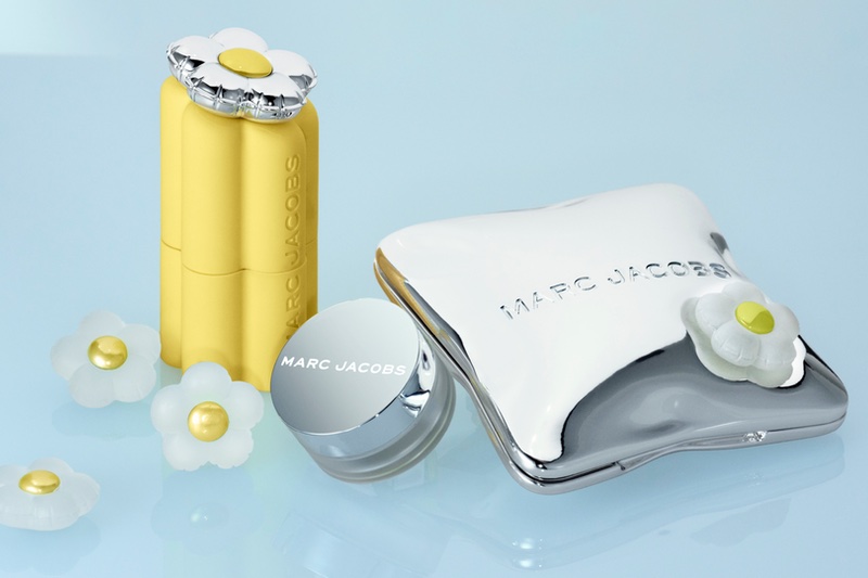
Marc Jacobs Beauty’s new look is in stark contrast to what the original line projected – a sleek, black, minimalist compact aesthetic – which was much more in keeping with the design codes traditionally seen in the luxury and prestige make-up category.
“Marc Jacobs Beauty is not starting from zero,” says Felipe Sena, Packaging Expert and Creative Director.
“The industry may have understood the discontinuation, but for the people who loved the brand, it simply disappeared one day.
“That absence created expectation, [and] so this packaging is not being read only as packaging, it is being read as the first expression of what this new era intends to be.”
Javier Zotez Ciancas, Global SVP of Marc Jacobs Beauty, recently told Cosmetics Business that this design shift was a “deliberate reset”, taking time to reimagine what Marc Jacobs Beauty could be”.
He adds: “The packaging is designed by [fashion designer] Marc Jacobs himself, and reflects his distinctive creative language, rooted in creativity, fun and self-expression.
“It combines bold colour, contrasting textures and exaggerated shapes, with signature charm motifs to identify each category.”
However, is this fresh packaging achieving what the brand wants – an ecosystem that is truly based on fashion designer Marc Jacobs design roots and playful DNA – or is it providing a collectable aesthetic that is ‘in right now’, but which may lack a truly collectable experience?
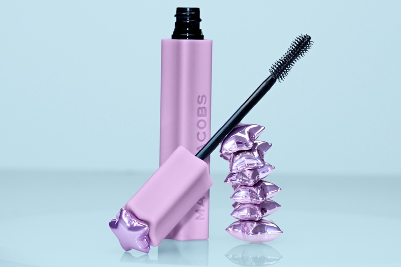
Marc Jacobs Beauty's Flashes Mascara
Inside the new packaging design
There is no denying that Marc Jacobs Beauty’s new packaging look is in stark contrast to the traditional design aesthetic of the prestige make-up category, which tends to present more as minimalist, muted codes.
“The brand already had a very powerful code [before]: black, glossy, sleek, chic, with a fashion sensibility that felt entirely its own,” argues Sena.
“It was not a generic black component. It had shape, attitude and a recognisable personality.
“An ownable, desirable territory that many original fans loved.”
The brand’s revamped make-up packaging comprises


