Gerresheimer has created packaging for two very different Interparfum projects: the youthful new Quicksilver fragrance and the more classic luxury style of S.T. Dupont.
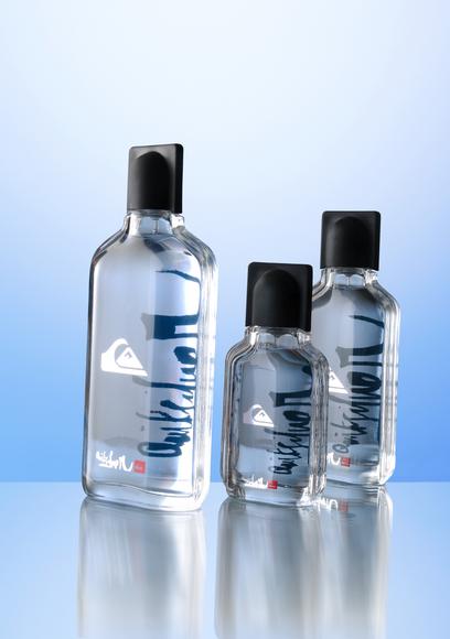
The name of the Quicksilver fragrance is printed in deep blue on the back of the clear glass bottle in a mirror image which is seen through the juice. This gives the name changing dimensions, designed to encapsulate what Quicksilver means in mercurial design effects so that even at rest the name is as lively as in a distorting mirror. “Even with all the optical activity the flacon has a beautiful and unexcited line,” says Burkhard Lingenberg, director of marketing and communication for Gerresheimer. The colourless glass contributes to this as much as the shallow flacon shape with relaxed sloping shoulders and accentuated side elements. The wording and logo on the front of the glass bottle in silver and red are designed to appear to float, apparently weightlessly, as fixed points against a moving backdrop.
The packaging for Dupont’s Passenger fragrance also very much echoes the ethos of the brand, renowned for items including lighters and leather goods. A glass bottle is encased in a black or white leather case with a large metal cap, giving the appearance of a businesslike novelty. The seams of the case are accentuated and the S.T. Dupont signature is printed down the side. “We have masterfully succeeded in putting untypical but brand-specific materials to use in the flacon set-up,” comments Lingenberg.


