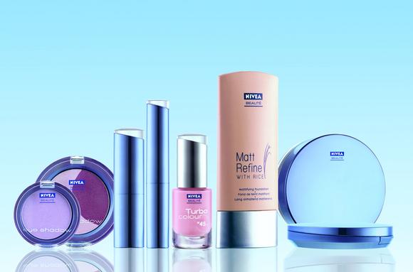
DieterBakicDesign recently carried out a substantial revision of the brand logo and packaging for key Beiersdorf brand Nivea Beauté, for a relaunch of the brand. The main difficulty in this, according to the design specialist, was the contradiction between the unpretentious nature of Nivea and the non-natural character of make-up itself. Consequently the creative marketing story focuses less on stylised perfection and more on simplicity and authentic femininity. The concept is intended to be lively and inviting and in opposition to the elitist ideas of some make-up artist brands. The product is designed to target active women with jobs and families, whose beauty routines have to fit in effortlessly.
A key difference between the old and new packaging is the colour scheme. It is now based on a shimmering airy blue shade, which aims to give the products a pure and precious quality. The attribute of transparency is designed to convey the message to the consumer that there is nothing to reveal; ie not for the product and not for the user.


